


Why a Barcode Needs Blank Space Around It
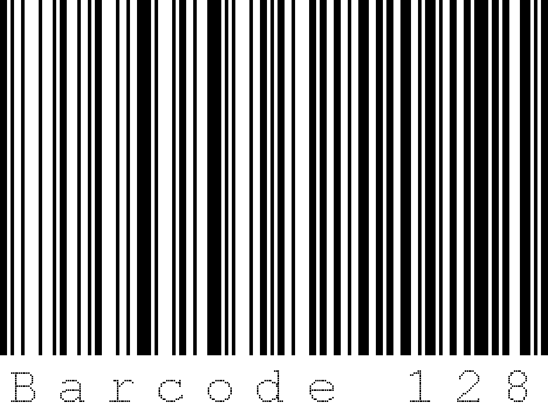
Featured illustration: Mattes / Wikimedia Commons, public domain; historical crop and compression by User000name. Illustration only, not barcode artwork for reuse.
A barcode looks like a row of dark stripes, but the light spaces carry information too. The blank margins beside it also have a job. Understanding those three elements helps explain why a label can look recognizable to a person yet still scan poorly.
Lines and spaces form a readable pattern
GS1 describes linear barcodes as patterns of lines and spaces with different widths. They encode data, including the Global Trade Item Number used to identify products. A scanner reads the symbol electronically using laser or image-based technology; it does not simply photograph the printed digits and treat every familiar-looking stripe pattern as interchangeable.
The barcode family matters. GS1 lists UPC/EAN for retail, while other linear formats serve different requirements. Two-dimensional symbols arrange data in patterns across an area. A square code and a row of bars may both carry identifiers, but they use different structures. Choosing a symbol requires knowing where it will be read.
Keep the quiet zones clear
The clear areas on the left and right of a linear barcode are called quiet zones. They are part of the usable symbol area, rather than spare packaging space. GS1 US tells users to leave these margins unprinted. A decorative border, nearby text or a crop that crowds the bars can interfere with a clean scan.
There is no single margin measurement to apply to every barcode. Use the requirements for the chosen symbol and application. For an existing label, preserve its surrounding blank space when placing it in a design. Do not trim it down until only the dark bars remain.
Good artwork still needs good printing
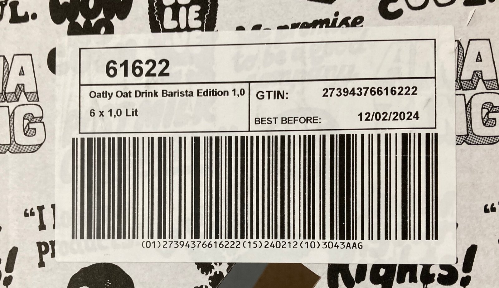
GS1 US recommends high-resolution artwork and printing so the bars and spaces remain clearly defined. Its preferred combination is black bars on a white background. It also warns against red bars when using red-light laser scanners. A combination that looks attractive on screen may therefore perform differently at a checkout.
Size and proportions matter as well. GS1 US says UPC symbols have a fixed relationship between height and width, recommends full-height printing and warns against cutting off bars to make them fit. Instead of stretching an existing image to fill a space, obtain artwork created for the required size and printing process.
A practical check before using a label
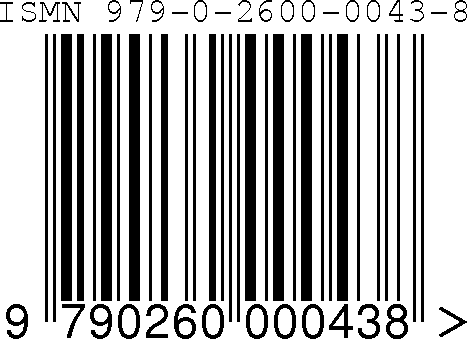
Confirm the barcode type required by the receiving system, keep the complete symbol and its quiet zones, and inspect the printed result rather than relying on a screen preview. Follow the applicable GS1 specifications and the requirements of the organization receiving the item. Recognizing a barcode with your eyes is useful; it does not establish that the printed symbol meets those requirements.
Official sources
GS1: Barcodes; GS1 US: Barcode placement and printing guidelines. Accessed October 24, 2026.
Written by OnelROR Editorial Team. October 24, 2026. 3-minute read.